Thinking out loud — Crafting a better wallet with psychology and communication principles
Crafting a better wallet with psychology and communication principle
Thinking out loud — This piece presents the position of the writer, Strontium, and doesn’t necessarily reflect the attitudes or plans of the Veil project.
Introduction
Allow me to begin with an anecdote. Recently my family visited the largely non-English-speaking nation I call home. They cannot read or speak the local language, so when my brother was asked to pick up some women’s face wash, he was overwhelmed by shelves of options. Naturally, he turned to me for translations, but it didn’t much help. We were enticed by buzzwords like ‘honey’, ‘hydro’, ‘silk’, and other technical words like ‘salicylic acid’ and ‘collagen’. My brother sighed in despair, and I observed. He passed over eye-catching fonts and beautiful models before snatching up a plain, unassuming bottle that simply read ‘FACE WASH’ in English beneath the product name.
My brother’s choice was one of function over form. He was not part of the existing market for whom the products were designed. He had no special consideration for any ingredient or trait. He simply entered the unfamiliar situation intent on achieving a comprehensible goal. In psychology terms, he used satisficing to navigate choice overload, i.e. he drew a good enough conclusion when faced with overwhelming choice.
Knowing the circumstances, my brother’s behaviour above is actually rather predictable, and thus can be controlled for by managing barriers to entry. This series of articles will focus on means of improving cryptocurrency software through consideration of psychological and communication principles to that end.
Part 1: User Intent

Picture two women chatting over a coffee. Woman A says she’s ready to find a husband and have children. Woman B asks woman A what qualities she’s looking for in someone to make babies with. ‘Good looking’, woman A may say, ‘Kind. Rich. Attentive…’. Rarely would anyone expect the answer ‘a fertile man’, despite it being the only essential prerequisite. That information is implicit in the question, and so taken for granted. Imagine woman A’s surprise should woman B set her up on a blind date with a woman, even if she did check all the aforementioned boxes. Such an action would be in direct conflict with woman A’s objective.
Like the above, fundamental features of a wallet should be self-evident. It’s reasonable to assume anyone running a cryptocurrency wallet intends to store currency in it, and later take that currency out. Achieving that goal is the user’s intention, but it’s the user’s intent I’m suggesting we consider more carefully. Intent differs from intention in that it’s also adjectival; so don’t think of intent solely as the user’s objective, but the state of mind they possess as they set out to reach it. Considering the user’s intent and designing for it by prioritising what is critical, relevant, and noise in that order will greatly improve their ability to achieve their goal.
So how can we do this? Think of designing the user experience as a one way conversation with the user, where you must answer correctly the questions they’ve no opportunity to ask. Humans enter new situations with a problem-solving mentality, employing heuristic techniques—basic problem solving processes— to establish a degree of order in the perceived chaos. To facilitate this, try being mindful of these 3 don’t Ds: Don’t distract. Don’t detract. Don’t digress.

Don’t distract!
A well designed UX identifies the objective of the user, and provides only information and options relevant to the immediate task in ways that feel intuitive. While this may seem obvious once said, it’s not uncommon as a user to run a new wallet application and find yourself reading through pages of jargon—terminology or definitions applicable only to a limited field or area—and supplemental feature descriptions prematurely. The experience is not unlike having a flyer shoved at you while crossing at a busy intersection; it annoys most people, even if the content fits their interests or needs.
Considering the above, it surprises that standard convention is to feature Send functionality over Receive—after all you cannot send what you don’t yet possess.
Let’s look at what I’d deem a more appropriate progression on first run by posing questions and offering solutions via design:
| Question | Solution |
|---|---|
| Can my device run the program? | If no, provide error and advice, such as where to visit for help |
| Can I understand what is in front of me? | Display language options, preferably with native script and, if feasible, a flag |
| Is this my first time? | Provide the option to restore wallet, avoiding terms like ‘seed’, ‘key’, and ‘wallet.dat’ unless this option is first selected. If the user does select to restore, the option to back out should be present (some people can’t help curiosity) |
| Is my wallet secure? | Provide security setup, avoiding the need for any third party installs for 2fa and the like at this early stage (the option to do so is okay, along with reassurance that this can be handled at any time) |
| How do I get started? | Begin with receive page, displaying the first tutorial pop-up (succinct and preferably visual) and carefully introducing only relevant terms |
| Where do I stand? | After receiving currency, direct the user to the Overview page so they may see their balance and transaction history if they wish—they’ve achieved a goal, so let them soak it up! The user should also be made aware of the Send page and additional security measures such as locking wallet and 2fa at this point in a first run |
Don’t detract!
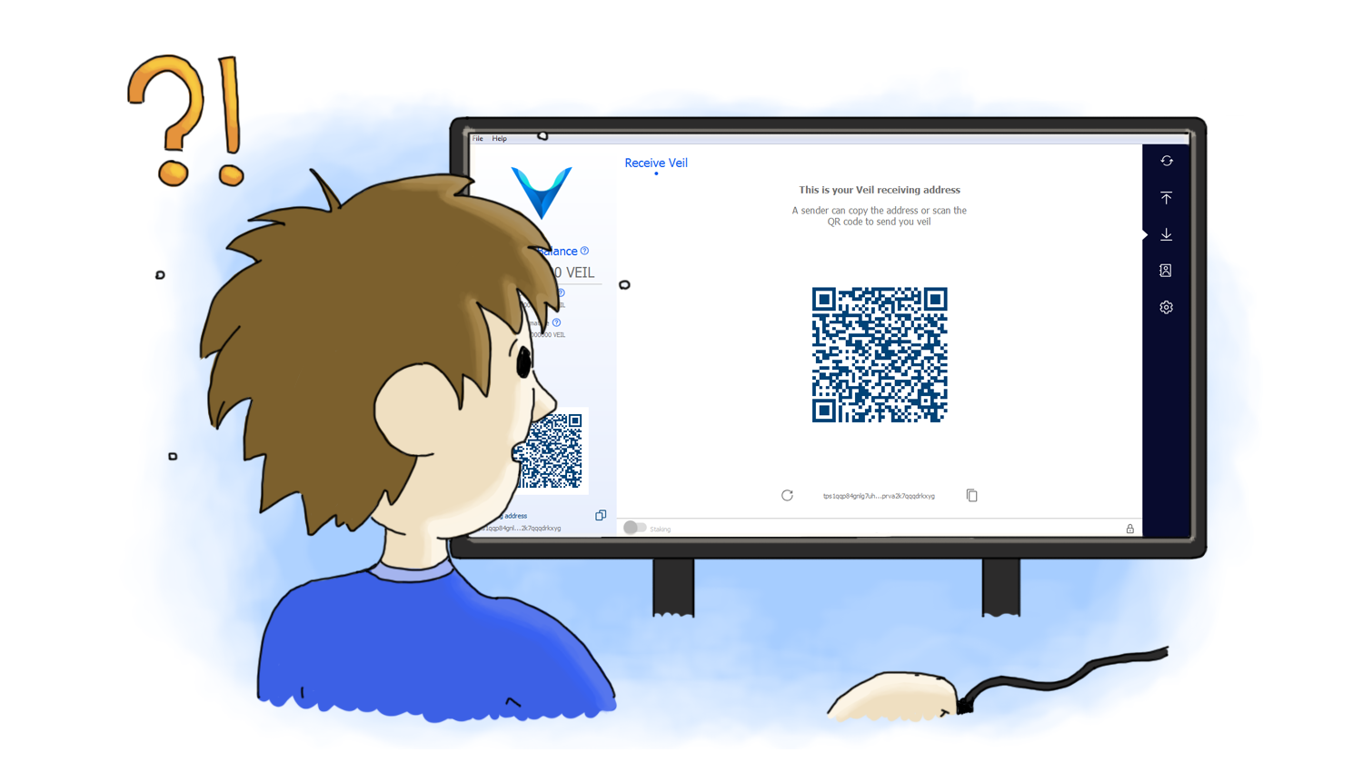
For now let’s chiefly consider a wallet’s Receive page. Currently, I see many wallets make the misstep of dedicating majority screen real estate to a QR code. Primarily users are going to be searching out a receive address as instructed by an exchange, mining software, or mining pool operator. Unlike address text strings, QR codes are visually distinct in a wallet, and if the largest feature, will detract from the presence of the critical feature that is the address proper. Considering that QR code functionality may rely on size, a simple scaling on click event could solve this.
An improved receive page would ideally involve a clear, legible label or description, as well as the address being in its expanded entirety and not truncated. If truncation cannot be avoided, to only ellipsis out the midsection of an address would serve best, as research has long supported the importance of the opening and closing letters in words background included in linked paper, and while addresses are not words, I anticipate these principles hold up.
Don’t digress!
Always remember user intent. Tutorials should only be displayed if they’re wanted—i.e. not if the user has restored—and if applicable to the immediate goal of the user. If some of the information in the current tutorial isn’t critical to the user’s current objective, don’t force feed it to them; you want to avoid information overload. There’s no harm in offering a branching tutorial window for example, where ‘close/okay’ is accompanied by ‘learn more’. Tutorial pop-ups should also be dismissible with a ‘don’t show these’ checkbox, and be reviewable at any time.
So remember, when designing a wallet your job is to harness user intent; help the user effortlessly achieve their goal, and do not distract, detract, or digress in doing so unless absolutely necessary.